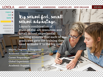
Loyola Homepage Redesign - admissions section
Alas, decided to keep fonts simple with just a sans-serif and slab-serif. This is a one page site and each primary navigation item links down the page to its section with links the primary user needs most. Super slimmed down IA compared to the current. Excited for this to launch next month.
More by Lauren Smith-Bynum View profile
Like

