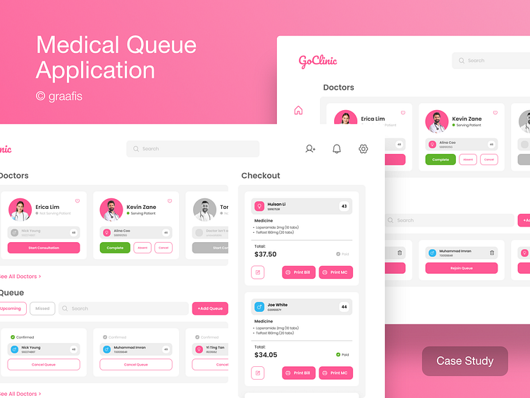
Medical Queue Application Case Study
Welcome to Medical Queue Application Design
Clinic staff in this clinic have a dedicated mobile tablet app called GoClinic to manage their entire workflow. This is separate from the doctor's app. Patients can visit these clinics in person or join a virtual queue online.
This app brings all your key clinic workflows together in one convenient location, organized into four clear sections:
Doctors, Upcoming Queues, Missed Queues, and Checkout.
Doctors
The Doctors section will show the doctors that are on duty and provide a quick way for clinic staffs to manage the patients/consultations for their doctors. If a doctor is serving a patient, the clinic staffs will be able to mark the patient as absent, update the consultation as completed, or cancel the consultation (for emergencies). If a doctor is not serving a patient, the clinic staffs will be able to start the next consultation for the doctor. If a doctor is not serving a patient as there is no patient in the queue, the clinic staffs will not be able to perform any action.
Upcoming Queues
The Upcoming Queues section will show the 5 patients who are next-in-line to see the doctors and help clinic staffs identify the patients’ records to prepare and the patients to call for the upcoming consultations. As patients may queue online, some of the patients may not be present at the clinics before their turns. To avoid uncertainty, next-in-line queues will be tagged as Confirmed when the patients are present at the clinics. At any point in time, the clinic staffs will be able to cancel the queues of the next-in-line patients, which will remove/delete them from the queue.
Missed Queues
The Missed Queues section will show all the patients who were absent when they were called by the doctors and provide a centralized place for clinic staffs to help these patients rejoin the queue.
Checkout
The Checkout section will show the patients who have completed their consultations and their medications and total bills, and help clinic staffs process these patients. Patients who have paid in advance will be tagged with the Paid status. Clinic staffs will be able to edit the quantity and price of the medications and/or the amount listed in the bills, as well as print the bill and medical certificate.
Based on the brief, I created user interface design and also pay attention to the user experience in my design. Here I divided it into 3 sections based on the condition: Upcoming Queues, Missed Queues, Empty Queues
Explanation
1. I added some features like on/off for the doctors row to make sure that the doctors are present/absent.
2. I assume that Staff Clinic needs "Add Queue" button because as patients may queue online, some of the patients may not be present at the clinics before their turns to avoid uncertainty.
3. Search in queue section will make staff clinic when the queue is overflowing.
4. Confirmed patient and payment status of patient could be marked with checkbox button
Upcoming Section
I divided queue to 2 sections (upcoming and missed) to make it looks more neater.
Missed Queues
I added a trash feature to make sure that the patient will cancel the queue and will never be back to the hospital/clinic.
Empty Queues
Empty queue makes the staff clinic not able to take any actions of the application.


