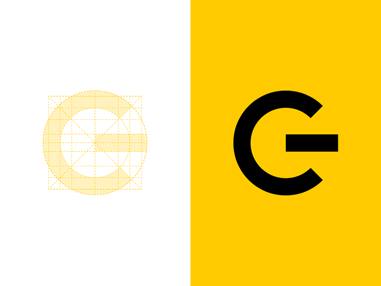
New personal logo
After thousands (more or less) drafts i finally managed to finish my new logo.
Like the previous one, this is a monogram for the letters G and C, but this time i started from a more deep concept. I design for digital products mostly, so i took as a starting point the symbol that you can find on almost any digital device: the 'power' symbol. https://en.wikipedia.org/wiki/Power_symbol
Then turn it 45 degrees right... and voilà! Seems like a really simplicistic procedure, but trust me it is not. The yellow background is a Pantone 116 (the standard LEGO color).
I'm quite proud of how this turned out :)
More by Gershom Charig View profile
Like
