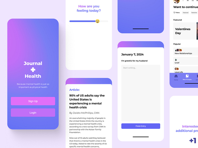
Journal Health: A Case Study
Design Brief
As part of Dribbble’s Product Design Academy, we needed to create a second capstone project. I decided to create an app focusing on the benefits of journaling and mental health.
Problem Statement
Mental health is a serious concern in both the United States and the world. More than 1 in 5 US adults live with a mental illness. I wanted to focus on the benefits of journaling for mental illness.
Statistics
As part of my research, I needed to focus on the data of mental illness. There are a variety of resources out there but a person must be willing to speak to someone and may be afraid. Some of the organizations that publish data and resources are the CDC, National Alliance on Mental Illness (NAMI), 988 Suicide & Crisis Lifeline, Mental Health America and more.
Meditation is a common style of dealing with various forms of mental illness, such as depression and anxiety.
Another common style is journaling. Putting all your thoughts out there for only you to read. The benefit of journaling is you don’t have to see someone for expressing your feelings, but you are getting the thoughts out there on a piece of paper or note app.
Competitor Research
Some of the main competitor apps offer both meditation and journaling.
The main meditation apps are Headspace and Calm.
Both Headspace and Calm focus on the benefits of meditation through guided meditations, sleep casts and soundscapes.
There are a variety of apps that have journaling features but it is usually not the focus. They include a journal option to a meditation, habit or affirmation app.
User Flow
My user flow is focused on the process of checking in daily, journaling your daily prompt and starting a habit.
Wireframes
After doing my research, I began working with a variety of wireframes for my app. I started researching the typical onboarding style for a general app and how information could be listed. Then I focused on the “mood option” and filling out the daily journal prompt.
Visuals
Moodboards
My two options both had a calming nature but were slightly different.
Moodboard 1 was focusing on calming colors and gradients. While the main content was clear, there were a lot of gradients in calming colors.
Moodboard 2 was photographic imagery based. I wanted to try and incorporate more photography in my design but after comparing my options, there would be too many elements going on. The app was meant to be simple and easy to navigate.
Check ins
As part of my app, I wanted to include a mood check in before the journal prompts. That way, a user could track their mood and journals over time.
Final Screens
After editing, I ended up creating a variety of screens. The flow for sign up and login was the same.


