Makeup Visions Mobile App Case Study
Design Brief
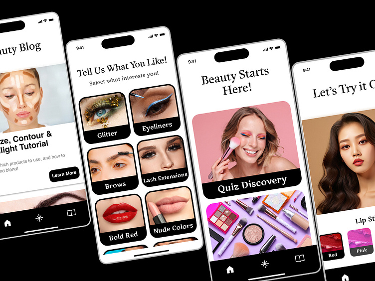
Create a Mobile App on Beauty for users who are new to everything about makeup and want to know where to startUsers should expect:
To determine what beauty products would be a great fit for user
To be able to virtually try on different products
To learn about applying makeup, where to buy makeup, and tips for beginners
Problem Statement
For people who are overwhelmed with makeup and do not know where to start.
User Research
After interviewing people that were able to tell me about their makeup journey, and a few young adults and preteens about where they would think to start on their makeup journey, the following conclusions were made:
The Users recollecting their journeys, expressed that they wanted the following:
Someone to help give them genuine advice, but not to feel overwhelmed on being pushed to make a sale
Wanted some insight on products than to just see what is on shelf. Are they actually worth buying?
Wanted to see what the products would look like on them
Young Adults and Preteens in their journeys, expressed that they wanted the following:
Look for items that did not have ingredients that could harm
Find out more about what the items that their influencers have, and if it will work for them.
They want to try on makeup virtually just like some other apps and show it to their friends for an opinion.
Market Research
The following apps would be the main competitors for MakeUp Visions app:
Perfect 365 Makeup Photo Editor:
1. PROS:
Focuses on virtually trying on makeup
Edit new styles created weekly
Video Tutorials
Can share looks on social media
CONS:
More like a photo editor than actually helping people find and understand the workings of makeup
IPSY: Personalized Beauty
Customizable beauty. Shares more information products and sells bundles. Has its own subscription service.
1. PROS:
Includes tips & tutorials
Make your own reviews
CONS:
Need a subscription to use most functions on the app
Persona
“ I did not know where to start with makeup and I had no one really to help me go to about it. When I was younger, I wanted some honest guidance or at least know where to start. I was completely lost.”
About Sally
Sally shares her story growing up as a young adult millennial with no guidance in the world of makeup. In her high school and college years as a student, she wanted to explore and express her style in the world of makeup and have fun doing so.
Goals and Ambitions
Understanding what makeup products are right for her
Tips and tricks on how to apply makeup
To try on virtual makeup looks that are doable
Frustrations
Not knowing what brands to shop for that are right for her
Not all looks look the same on every person
Need looks that are affordable
Finding a how to video or some kind of tip or trick for guidance
User Flow
Geared toward the young adult or any makeup beginner looking for guidance on beauty in makeup.
Customizable beauty picks
Beauty virtual try on
Beauty Blog for tips and tricks
Wireframes
App Introduction Onboarding Screen, Goals
To give the user a clear understanding of what they can get out of this app
Clean simple user friendly interface
App Makeup Vision, 1st & 2nd Round
App needs to be simple so the user does not feel overwhelmed
App needs to be fun and interesting
Aim to get the user interested in makeup, in hopes to try and buy products
Visual Designs
A revision needed to be done throughout my initial designs. I needed to make the app cleaner and have the beauty of the images stand out. The design process needed more research and simplicity.
Prototype + Test
A work in progress, but enough to understand the basic flow.
Prototype Link
Testing Summary
There needs to be more testing and more adjustments. This is just a start.
Outcome/Results
There are a few changes and updates that I would like to test and achieve. The user easily can navigate through the interface and achieve a fun and learning experience in the world of beauty. However, there is always room for improvement and that is what I would like to achieve.


