Logo for a Consulting company in Emirates
Aurum provides consulting services: starting a business, obtaining visas, opening a current account.
It is necessary for the logo to convey business spirit, trust, professionalism, "the spirit of the Emirates".
I proposed the following visual solutions for the logo:
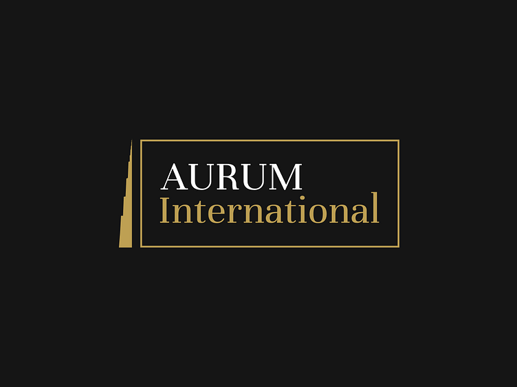
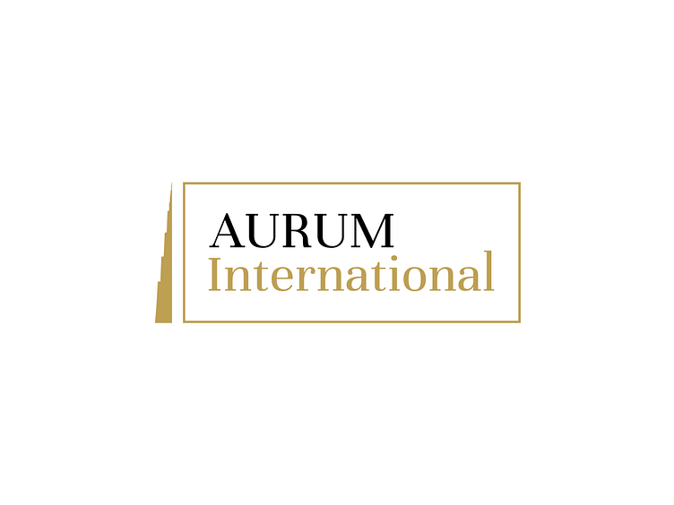
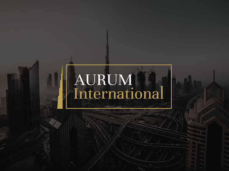
1/ Gold color was chosen to emphasize status and premiumity. Thin lettering of fonts so as not to weigh down the weight of the composition and for the main version a serif font was chosen to convey the sophistication of the brand.
2/ The silhouette of the Burj Khalifa was used as the symbol, as it is Dubai's calling card. Our brain is so organized that it reads familiar objects and signals to us that there is no danger because the object is familiar to us. A person does not feel wary when seeing the logo, as it reads the symbol as something familiar, so that unconsciously forms trust in the company at the first visual contact.
The logo can be easily adapted to the web and printing. The target audience of the brand is non-native Emiratis, so the symbol is located to the left of the text, as Europeans read from left to right.
When translating the logo into Arabic - the symbol should be positioned to the right of the text.
Компания Aurum оказывает консультационные услуги: открытие бизнеса, получение виз, открытие расчетного счета.
Необходимо, чтобы логотип передавал деловой настрой, доверие, профессионализм, "дух эмиратов".
Поэтому я предложила следующие визуальные решения для лого:
1/ Был выбран золотой цвет, чтобы подчеркнуть статусность и премиальность. Тонкие начертания шрифтов, чтобы не утяжелять вес композиции и для основной версии был выбран шрифт с засечками, чтобы передать изысканность бренда.
2/ В качестве символа использован силуэт Бурдж Халифы, так как это визитная карточка Дубая. Наш мозг так устроен, что считывает знакомые предметы и передает нам сигнал, что опасности нет, так как предмет нам знаком. Человек не испытывает настороженности, видя логотип, так как считывает символ как нечто знакомое, вследствие чего неосознанно формируется доверие к компании при первом визуальном контакте.
Логотип можно легко адаптировать под веб и полиграфию. Целевая аудитория бренда — не коренные жители эмират, соответственно, символ расположен слева от текста, так как европейцы читают слева направо.
При переводе логотипа на арабский — символ должен быть расположен справа от текста.