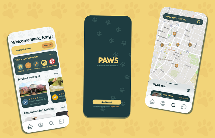
PAWS–a dog walking app case study
Hi everyone! This project was a part of the Product Design Academy course that I took through Dribbble.
Project Overview
The goal of the project was to develop an onboarding process for a fictional dog walking app. I was responsible for conducting user research, defining the problem, creating a user flow based on the research, establishing a visual design that I could scale across multiple screens, and finally prototyping the finished screens.
Research
My first steps in researching this project were to interview current dog owners and identify their needs and pain points when looking for a dog-walker. I interviewed users from my area––Harrisonburg, Virginia, and talked to people who have previously used dog walking apps and those who had not. The general consensus was that users wanted someone trustworthy, reliable, and someone who would love the dogs as much as the owners do.
User Flow
After finishing my research, I began building out a user flow. I kept it simple and was inspired by on-boarding flows in other service apps such as Planta, Rover, and Taskrabbit.
My initial user flow was very simple, as this was my first time creating one, but as I developed my project, I ended up with two different experiences. I decided that I wanted to tell two different stories, the first being a sign up process for a new dog owner and the second being a sign in process for an existing dog walker looking to get a walk done.
Wireframing
After I finished my user flow, I began building out my wireframes. I first began by sketching out some low fidelity frames and later created my high fidelity frames.
During the wire framing process, my goal was to create a simple app that would be easy to use. I wanted the app to be similar enough to other popular service and social media apps so that new users could navigate easily.
Visual Design
Before beginning to scale the design across multiple screens, I got inspiration from other sources. I created a mood board and played around with different styles across a single screen. I was inspired by classic dog toys and beds with paw print designs and wanted to find a way to incorporate that into the app design without making everything feel crowded. The process took some time, as I had to play around with different text styles, color schemes, and layouts. I wanted the app to feel fun and playful without being too cluttered. Eventually I decided to go for a simple design and created some paw pattern components that I could easily style as I worked.
Prototyping
My final step after establishing the visual design was to prototype the multiple screens I had created. This was my favorite part of this process. I decided to try several new prototyping tricks that I had seen tutorials for on Pinterest and Youtube. I played around with creating a calendar that had multiple interactions as well as a pull up drawer and timer feature!
Check out the final product :)
Dog Owner–Booking a walk
Dog walker–Starting a walk
Final Thoughts
This project was super helpful in reinforcing the lessons I learned in my UI introduction course from earlier this year. I definitely felt a lot more confident in my understanding of Figma. My goal in this project was to incorporate more customizable components and I think I was able to achieve that! I’m super grateful for my mentor Chris and my fellow classmates for providing feedback and guidance throughout the entirety of this project.
I’m super excited to tackle more projects in the upcoming future!


