38a2a428683057.55cca41a25504
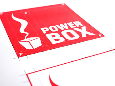
Powerbox, a brand new kind of fast food. Low-fat, healthy and above all tasty. It all started with a mobile power box in Viennas 12th district and recently a new restaurant opened in Viennas 6th district. Also this with design and concept by freiland. Our first job was the complete rework of the old logo and furthermore to create an entire corporate design. except keeping the red color we completely re-worked the logo (even the red was tweaked for added freshness). Back to the basics: A box is a box. Therefore the new logo is also a square. Following this string of thoughts, also the word-mark ‘PowerBox’ was broken into two lines. Equally powerful as the red, and a reminiscence of sport brands, our chosen font was the Geogrotesque from the barcelona based Emtype. Following the franchise idea of the Powerbox system, it was all about developing a logo that would work anywhere and in any form. Negative, black&white, on a a bag, or as a neon sign… Currently we are revising and updating the logo. Stay tuned for an update!
