Enhance the website of FBF to reach more member
My Role:
UX researcher and UI designer
My team:
5 UX designer
Duration:
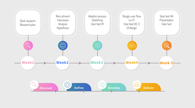
6 Nov 2023 - 15 Dec 2023 (5weeks )
Tools:
Figma and Figjam
Challenge:
Make it easier to become a member, Make secondary level clearer and Hiring us page easier to find
Who is FBF?
Fredrika Bremer-förbundet educates and informs men and women about equality. The organization is doing it for all women and men but reaches mostly women in the age of 60 and up in Sweden.
To acquire more members through the deep understanding of the current users and non- users, in order to improve FBF’s existing website according to the needs.
PROBLEMS
Understanding the reason(s) that are currently avoiding to get new members by Perform qualitative research, gather, analyze, and present data.
Understand the demographics that we need to get as new members by interviewing non-users we want to understand the drivers that possibly attract them to connect with our purpose.
Analyze the current website by develop either the enhancement of it or a new prototype / features if needed.
THE PROCESS
STATEMENT OF INTENT
Find out why people join Fredrika Bremer Association and check how easy their website is to use. We're talking to people and studying data to learn why they join and see how we can make the website better, helping the association grow stronger.
HYPOTHESIS
it´s more likely for them to become a member
If people feel inspired
If people know how the money is used
If people have the correct information
If people can navigate easily
RESEARCH METHODOLOGY
In Depth Interview and Usability test were our methods we used.
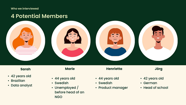
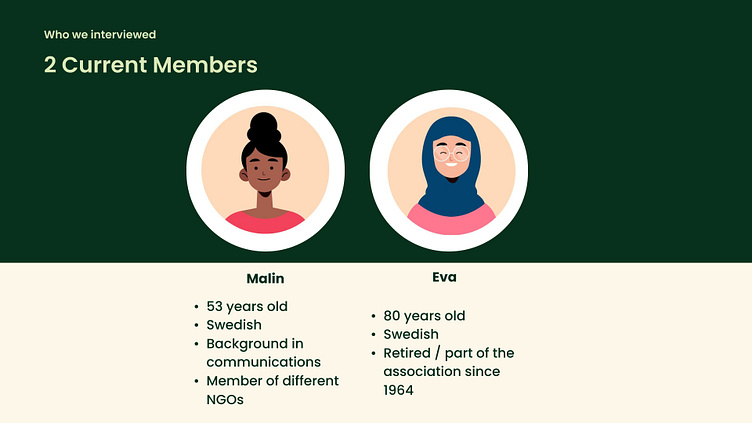
RECRUITMENT PROCESS
Internal email list
Social media recruitment
We'll explore the key findings that came out of our interviews and how they guide us in making Fredrika Bremer Association even better Website.
FINDINGS
It's tough to find info about what Fredrika Bremer wants to do. Because of that and the website being not so good, people might not know why joining is a good idea. Also, the website is not very clear, making it hard to find things and trust the membership.
SO...
People who might want to join need more than just info – they want to feel inspired. They should easily see what FBF is up to and have a simple way to join. The website needs to be easy to use, with clear buttons and menus. Everything should be straightforward, so users can quickly figure out what's what. And, of course, the content should look good and catch their eye.
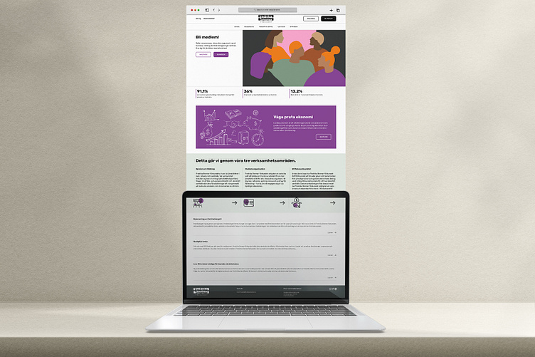
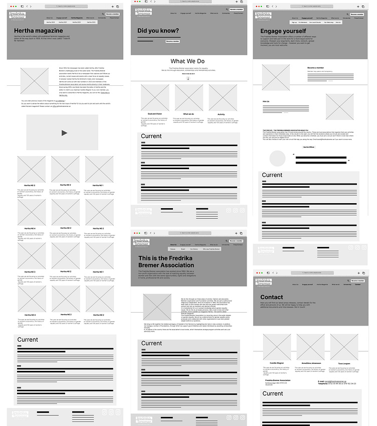
WIRE FRAME
After finishing the Low-fidility, we did four rounds of testing with real users to make our product better. We listened to what users said, fixed any problems they found, and improved how everything works based on their ideas. This back-and-forth process helped us catch and solve issues early on. Now, our final design is easy for users to understand and use because we learned a lot from their feedback during these tests.
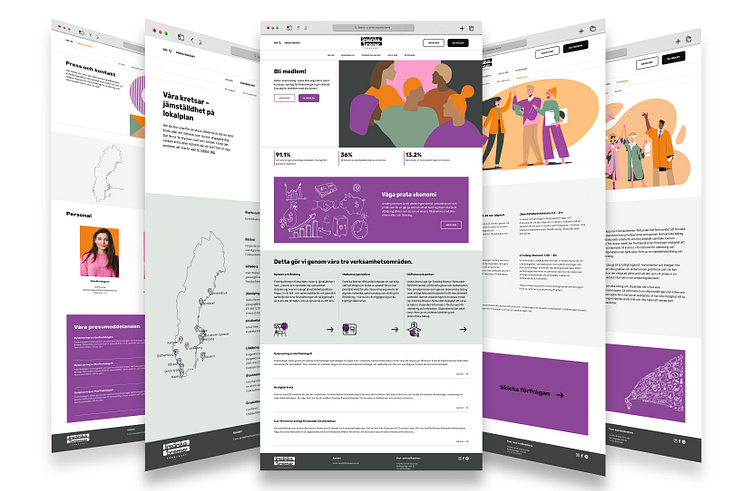
We picked the purple and orange colors for our design because they match our client's brand book, ensuring a consistent and recognizable look. These colors were specifically chosen to convey a sense of optimism and royalty, creating a positive and prestigious vibe. On the homepage, we included inspiring sentences and static numbers to highlight the significance of our client's work in promoting equality. This combination of colors and content aims to engage users emotionally and emphasize the impactful nature of the organization's mission.
