Business Quant Website Redesign
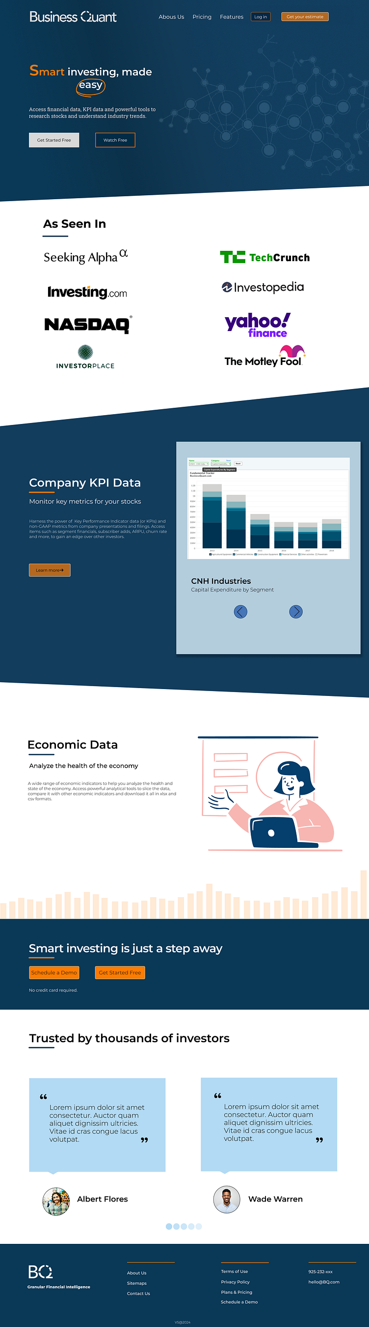
I started by delving into the details and design structure of the Business Quant website. After gaining insights, I translated my ideas into a basic sketch in my notebook, creating a visual foundation. The next step involved crafting a wireframe to establish the layout and placement of key elements, providing a blueprint for the design.
Considering the importance of a cohesive visual identity, I carefully selected a color palette and typography that aligns with the brand. Moving on to the homepage, I experimented with different images until finding the most suitable one. The goal was to make the "Smart investing, made easy" section not just informative but also visually appealing.
In the "As Seen In" section, I repositioned company logos to achieve a more compact yet aesthetic appearance, enhancing the overall professionalism of the page. For user interaction, I focused on the bar chart, creating buttons and labels. On the economic data page, I incorporated an appropriate SVG and manually designed bars to symbolize stock fluctuations, aiming for clarity and visual interest.
Recognizing the importance of testimonials, I redesigned the section, using a different color to make it more appealing and stand out. In the footer, I organized information into three columns, ensuring a clear and accessible presentation of essential details.
Throughout this process, I embraced an iterative approach, making adjustments to elements like images and layouts for better alignment with the overall aesthetic and user experience. Looking ahead, I plan to gather user feedback to refine and improve the design, ensuring it effectively meets the needs and expectations of the target audience.
