Travel Agency - Hero Section
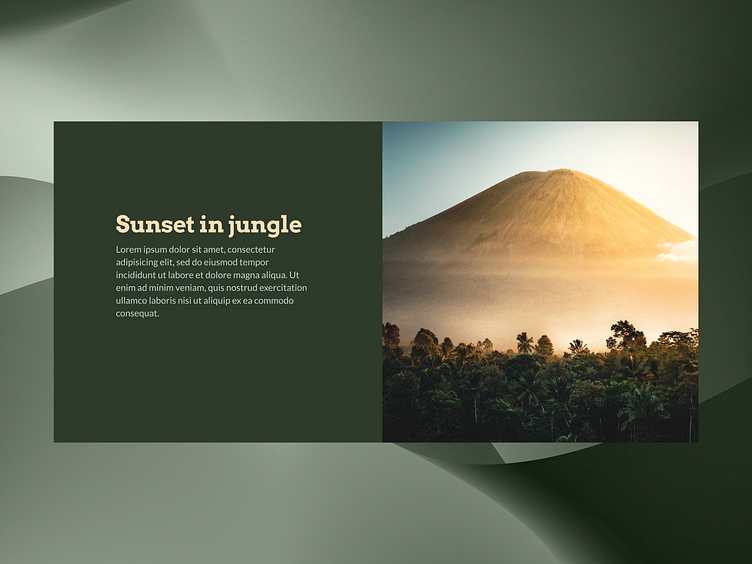
The contrast between the text and the background is high, which is good for readability. However, the placeholder text should eventually be replaced with actual content that is informative and easy to digest.
Color Scheme
The design uses a subdued color palette with a focus on earth tones, which evokes a sense of nature and tranquility.
More by Martin View profile
Like
