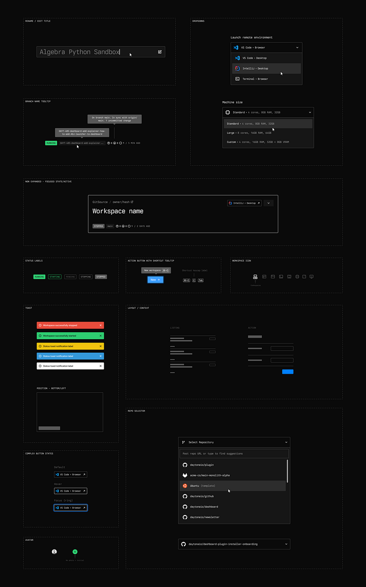
UI spec sheet
Some product design work artifact from Daytona.io dashboard project.
In very early stage projects I always go for this type of "stickersheet" specs instead of a "real" design system defined in a separate file as a clean library. Simply because there is nothing and I prefer iteration velocity to system thinking at this stage.
Of course the pivot the system phase is a big effort but it's also an testimony to the health of the project. More often than not the variables and components defined in the working files fit together without needing major work or compromises.
Most of the "components" are styled common pattern and primitives, nothing fancy. From my recent experience the bulk of the challenge in product design come from flexing the layout while fitting UX good practices... a very polite way to say "cram all the features while keeping as functional and accessible as possible".
Keep it real
✌️
