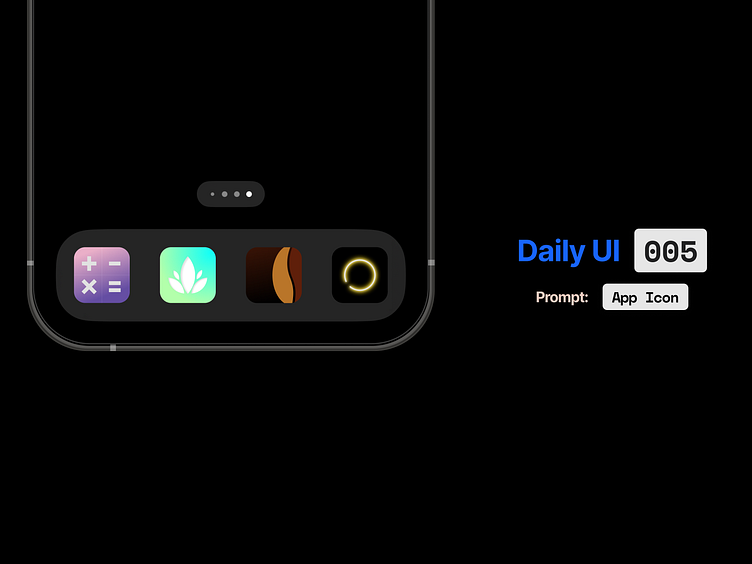
Daily UI 005: App Icon(s)
I've always wanted to design an app icon but never really had a need to. This prompt was a nice excuse to give it a go.
I enjoyed it so much that I ended up designing icons for 4 apps:
My calculator app
A plant app
A coffee shop
My GeoDungeon game
One of the main challenges I had with this was that app icons are often very simplistic, but to get something so simple to look objectively good can be challenging. The most difficult one for me was the coffee shop app, for which I ended up with about 10 iterations.
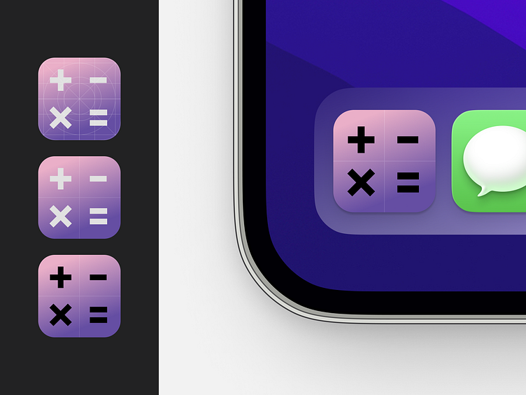
Calculator App Icon
It seemed right to design an icon for the calculator app I had just designed previously. Nice to have some continuation. I'm a big fan of apps giving me options of which icon I'd like to use so I did a dark and light version.
I used the same icons that I created for the app design, but had to make some tweaks, increase the thickness and adjust the sizing here and there to make them look right in the context of the icon.
I opted for the equals symbol in the bottom right, when initially I wanted to use the division symbol. It just didn't look quite right alongside the other icons.
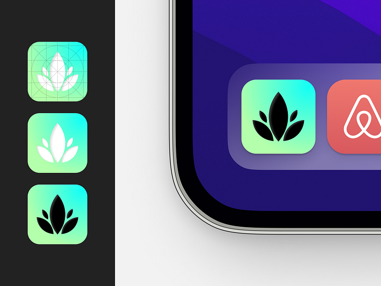
Plant App Icon
I wanted to do a design for an app that doesn't exist and something that I haven't already worked on, so I decided I'd do a plant app for no other reason than I like plants. As it turns out, designing an icon for something that you have no other context for is very difficult! This had a few iterations and I played around with some of the smaller details for a while, although ultimately liked the lotus-ish looking plant icon I ended up with. Again, I did a light and dark version because I like options.
All the shapes used are the same shape scaled up/down with a slight inner shadow used to add some depth.
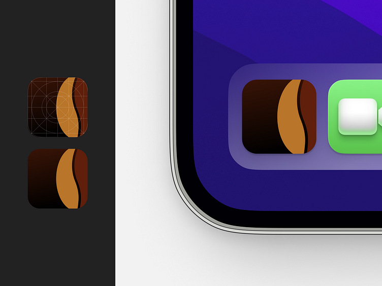
Coffe Shop App Icon
I figured that since I'd struggled with the plant icon due to having no context on what the app was etc., I'd give my coffee shop design an icon. It took me a while to settle on a final design. I went through a ton of iterations of various slight gradients, different colours, wider/narrower split down the middle of the bean shape, but ultimately decided simple was the best way to go.
I ended up with this flat bean shape, which I really like, and used colours taken from an image of espresso being poured. I initially had the icon on a pure black background and the gradient was a last minute addition, but it completes it in my opinion.
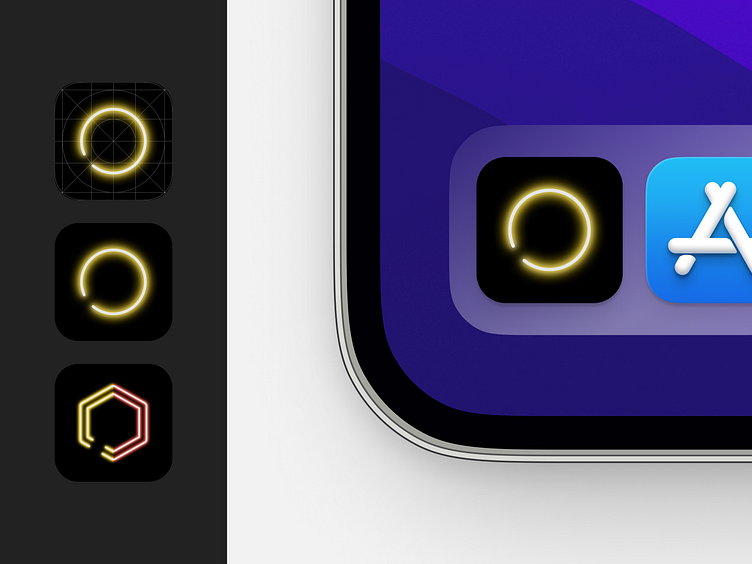
GeoDungeon App Icon
Since I designed and built this game, I've put a lot of time into creating assets for it, so this icon was the quickest and easiest to create. Since I have plans to make it an app at some point, it was great to feel like I was working on something 'real' after having done a few practices with the icons above.
This was an easy choice for me in using the gold neon circular shape (the player character in the game). I also created the split gold/red neon hexagonal shape, which is used in the game's interface in various places, and felt it was a nice option to make the icon a little more interesting from the easy choice.
I did a couple of variations using the red neon triangular shape (in-game enemies) as I thought it might be a nice option for some customisation. Ultimately I decided not to feature it here as I prefered the two above.
