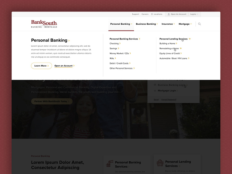
BankSouth - Website Redesign, Mega Menu
For navigation and wayfinding, our objective was to clean up the sitemap and overall architecture of the website, and that meant a very intuitive navigation in the header, consisting of both Primary Navigation and Secondary Navigation, along with an option for people to log in, as well as create a new account with BankSouth.
To strengthen the navigation, we crafted a very utilitarian mega menu, pictured in this shot. The left-hand column restates the Primary Nav item, and provides an opportunity for contextual paragraph text, and also CTA buttons if applicable. Then, in the right-hand columns, we list out the "children" pages that exist beneath the Primary Nav item (aka the "parent").
Visually, to add some prominence to the mega menu, we use a slightly transparent dark overlay... this practice simply helps add some separation between the menu and the content below.
