Quesmed brand design
Hey Dribbble!😉👋 I'm thrilled to show you the branding we designed at 10Clouds for our client, Quesmed.
Quesmed is the learning platform for medical students and doctors, providing a real look into medical knowledge, practice questions, and progress tracking. It's like having a personal tutor that helps you navigate the vast world of medicine, making studying less overwhelming and more enjoyable.
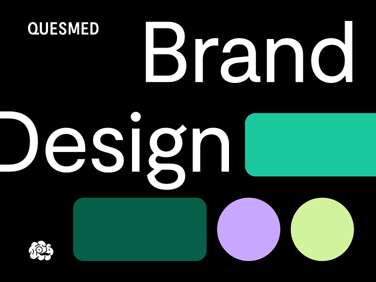
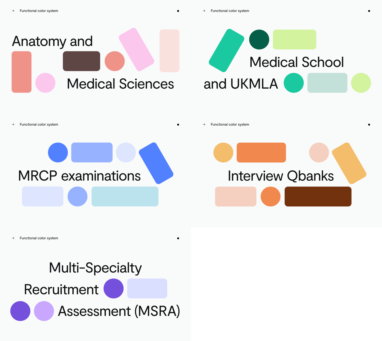
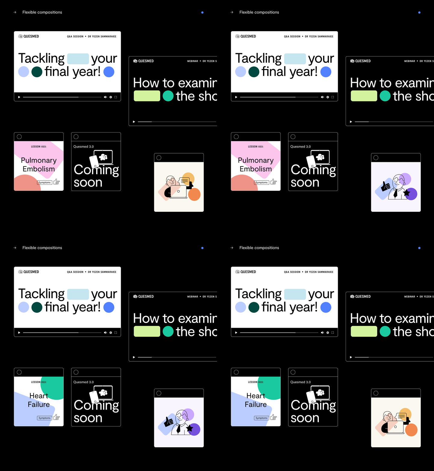
The concept for the brand is based on the theme of flashcards. They are presented as colorful blocks that are initially chaotic but later begin to organize and create unique compositions. This metaphor reflects how Quesmed operates – helping organize knowledge and making learning easy. Simple and friendly illustrations, an engaging color palette, and modern typography all come together to create a unique Quesmed Brand.
Check out the full case study on 👉 Behance 👈
Do you like our work? We’re available for new projects!
Tell us more at hello@10clouds.com


