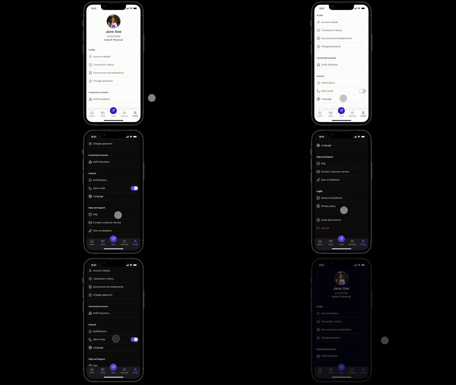
Finance app - 6. My account & Profile screen
Hello Dribbble designers!
Here is my Series of 6 essential mobile UI screens. I hope you'll find it useful!
Today I'd like to show you 6. My account & Profile screen.
"My account & Profile" screen:
The My account & Profile screen offering users a comprehensive view and control over their account settings, personal information, and customization options. Here are key principles for designing the "My account & Profile" screen:
Clarity and Accessibility:
Prominent placement: Ensure easy access to the My account & Profile screen, typically through a clearly labeled icon or menu item.
Intuitive navigation: Design a straightforward navigation structure, guiding users to relevant sections with minimal effort.
Personalization:
User-centric design: Prioritize elements that allow users to personalize their experience, including profile pictures, display names, and theme choices.
Comprehensive account information:
Overview section: Present a concise summary of the user's account information, including account type, membership status, or subscription details.
Transaction history: Include an option to view or download a comprehensive transaction history for transparency.
Profile editing:
Editable fields: Allow users to easily edit and update profile information. Use inline editing or clear form structures for a seamless experience.
Communication preferences:
Notification settings: Provide control over communication preferences, allowing users to customize the type and frequency of notifications they receive.
Opt-in and Opt-out options: Clearly indicate opt-in and opt-out options for newsletters, promotional emails, and other communications.
Support and Help resources:
Help center links: Include links to relevant help and support resources, FAQs, and customer support channels.
Educational elements:
Informative labels: Use clear and concise labels for each setting or action, providing users with information about the purpose and potential impact.
Usability testing:
User Feedback: Collect user feedback through usability testing to identify pain points and areas for improvement.
The My account & Profile screen provides space to manage account settings and personalize the digital experience.
We've explored 6 essential mobile UI screens, each prioritizing clarity, accessibility, and user-centric design. I hope you've gained valuable insights from this series. Stay tuned and happy designing!
Feel free to leave your feedback. And if you like my work, please press "L".
Thank you!


