Visual weight, Alignment, and Power
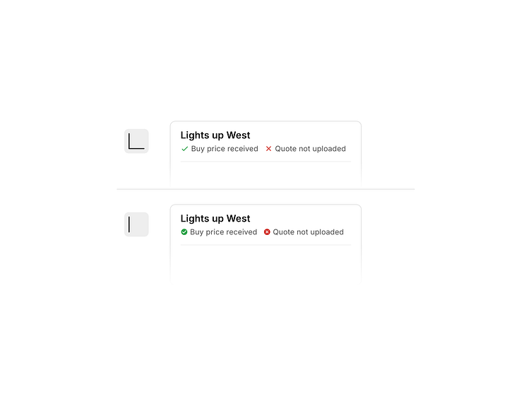
Icons with lighter visual weight affect the perceived alignment of the line. Especially at smaller sizes.
Filled icons with more weight feel aligned. Although, they end up feeling more powerful than needed.
Icons with lighter visual weight affect the perceived alignment of the line. Especially at smaller sizes.
Filled icons with more weight feel aligned. Although, they end up feeling more powerful than needed.