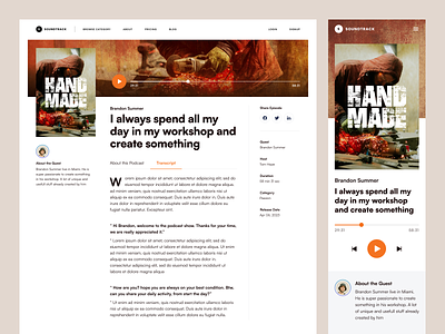
Torche - Course Detail Page
Better late than never.
A little behind schedule, but I'm happy to present my latest work.
The next user story to be redesigned is how students view the details of a course after finding it.
I tried a different layout approach, but the many visual components made it challenging to adjust the layout.
What do you think?
✲✲✲
Layout inspiration from Paperpillar's Detail Page Podcast Website.
More by Naufan Darmawan View profile
Like

