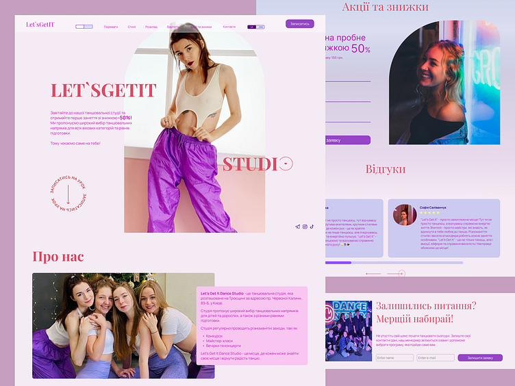
Concept landing page design for a dance studio
Hello, this project is a landing page concept for a dance studio.
About:
"Let's Get It Dance Studio" is a young, but dynamically developing company that has been working in the field of dance for 4 years and teaches everyone to dance. During this time, the studio gained great popularity and gave more than 1,000 students the opportunity to reveal their dancing potential.
Task:
Business card - the site should show the advantages of visiting these dance classes. Convey with the help of visuals the atmosphere that is present in the classes. Cover the fear of beginners, show that it is not difficult. Possibility of receiving feedback through the website.
Solution:
A block has been created with photos of teachers, about their experiences. Blocks have been created with the opportunity to sign up for a lesson and get a discount. A list of advantages of dancing lessons with a teacher has been compiled Bright buttons have been created that encourage action (sign up, buy, log in). Customer's wish: Bright colors were used to create the website, conveying the energy of the school.
When choosing the main fonts, the guideline was that they emphasize the elegance and modernity of the project, add energy and movement and be easy to read.
The colors were selected in accordance with the emotions that the dance studio creates: euphoria, drive, positivity, inspiration.
A little more ✨
I will be glad to cooperate💫
Get in touch with me:
feelingmos@gmail.com | telegram | behance
Don’t forget to press “💖” and leave comments
if you like this project.


