Checklist App
Design Challenge
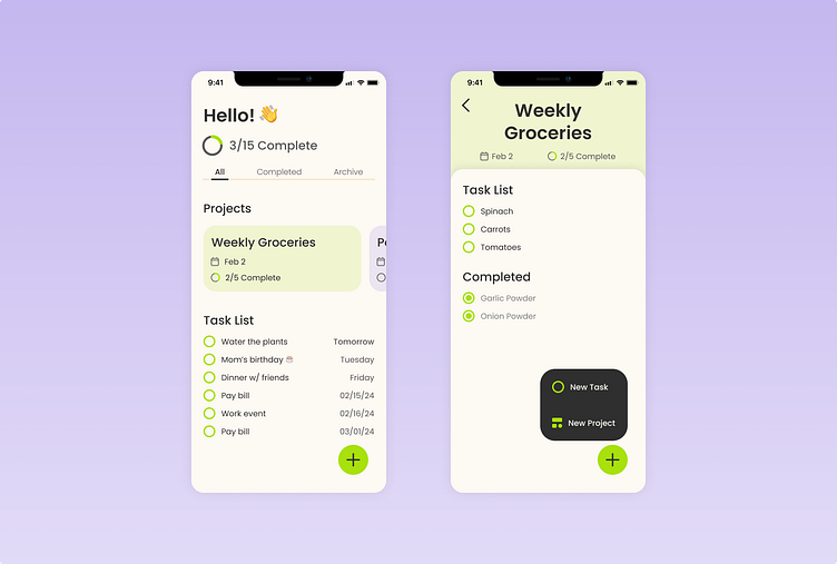
Design the main screen of a checklist app. Think about how users add items to their list, check off completed items, or see recently completed items.
Solution
In crafting the main screen for this checklist app, my primary focus was on enhancing user experience through a seamless and intuitive design. The interface prioritizes organization, allowing users to effortlessly add and manage tasks with a clear and simple layout. The incorporation of color-coded categories ensures visual clarity, aiding users in swiftly identifying different projects. To promote productivity and a sense of accomplishment, completed items are prominently displayed in projects and easily accessible, encouraging users to review and reflect on their achievements. Overall, my design prioritizes efficiency and user satisfaction, providing a streamlined platform for managing tasks and celebrating completed projects.
Tools
Figma
