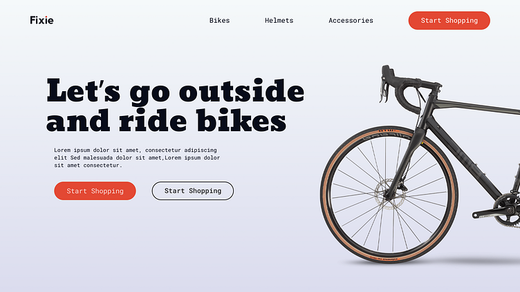
UI Fundamentals - Typography
Hello!
I am excited to share today's mini design work in progress (WIP) - UI Fundamentals focusing on Typography.
Typography improves the layout of designs and serves a key pillar.
The choice and execution of typography can convey a powerful message about a brand or design. Whether styled with finesse or personalized, 'type' alone can effectively articulate your design concept!
Within product design, typography plays a significant role in guiding users to the right destinations. It's crucial to employ easily comprehensible fonts that bring clarity to the app, aiding users in achieving their goals.
I tried to find the right font by scanning through a multitude of Google fonts as you can see below and just figuring out which type face would suit the atmosphere of a bike website. Some fonts might look fancy and very creative but also not very functional in regards to legibility and accessibility criterias.
This was a fun exercise to see how font can change the look and feel of a design to be more whimsical, playful, rigid, engaging and mostly memorable.
Let me know which ones you like or dont below and any of your favorite fonts.
I Hope you like it!
Let me know your thoughts in the comment section.
Don't forget to gently hit the like button and show some love
Thanks:)


