UI Fundamentals - Color
Hello!
I am excited to share today's mini design work in progress (WIP) - UI Fundamentals focusing on Negative Space.
Color improves the layout of designs.
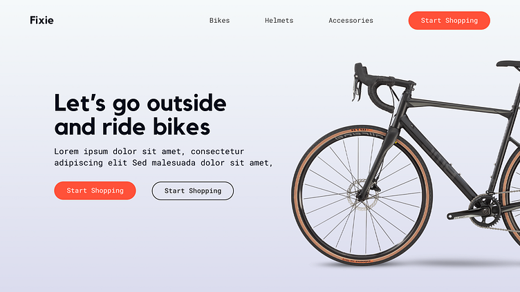
Color is a design basic that creates the atmosphere of your overall design. Its important to have a basic knowledge of color theory. Color or color palettes can be used to provide contrast/ draw users attention to a call to action (CTA) and complement elements in a design.
I tried to create this by using an orange color for the 2 CTA's (Start shopping) as that the action I would want users to perform when they see this design. The color orange denotes the sense of vitality, happiness, vibrance, optimism and energy. Which is well suited for a bike website.
I Hope you like it!
Let me know your thoughts in the comment section.
Don't forget to gently hit the like button and show some love
Thanks:)
