UI Fundamentals - Contrast
Hello!
I am excited to share today's mini design work in progress (WIP) - UI Fundamentals focusing on Contrast.
Contrast improves the layout of designs.
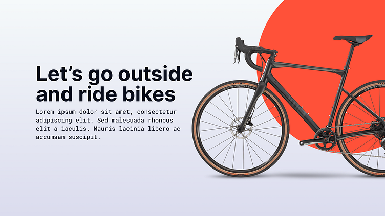
Contrast is what guides the viewer's attention to key details in design and in this case it is the bike. Contrast can be achieved by many means through the use of color, shape, size, imagery, typography, negative space etc. The aim of the game is to create drama in the layout.
I tried to create contrast by increasing the size of the bike image, and using color and shape to draw viewers attention to the key element which is the bike. I tried different versions where I placed the orange circle in different areas in the layout as well below.
So let me know what draws your attention in this design and which you like best.
I Hope you like it!
Let me know your thoughts in the comment section.
Don't forget to gently hit the like button and show some love
Thanks:)


