UI Fundamentals - Alignment
Hello!
I am excited to share today's mini design work in progress (WIP) - UI Fundamentals focusing on Alignment.
Alignment improves the layout of designs!
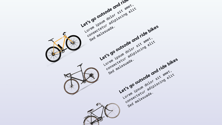
I tried to achieve this sense of alignment by bringing the subheadings, body content and images to align next to each other / by the invisible axis using figmas alignment tools. In doing so it creates a seamless visual connection with the design elements no matter what direction you rotate them or place them off canvas. The goal is to make sure they are visually connected by font, size, proximity and color.
To create an invisible axis create a rectangle thats long enough to serve as a divider between the images and subheadings and body content and then hide it/ delete it.
I Hope you like it!
Let me know your thoughts in the comment section.
Don't forget to gently hit the like button and show some love
Thanks:)
