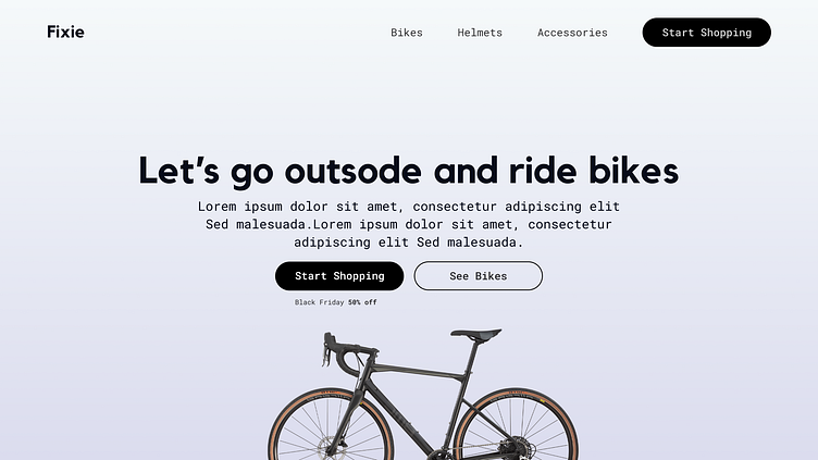
UI Fundamentals - Proximity
Hello!
I am excited to share today's mini design work in progress (WIP) - UI Fundamentals focusing on Proximity.
Proximity improves the layout of designs!
I tried to achieve this sense of proximity by bringing the headline, subheading, buttons/ call to action and image closer together so they seem related to each other thus creating emphasis. These elements need not be grouped together. Rather, they should be visually connected by font, color, size and distance.
I Hope you like it!
Let me know your thoughts in the comment section.
Don't forget to gently hit the like button and show some love
Thanks:)
More by Nompumelelo Dube View profile
Like
