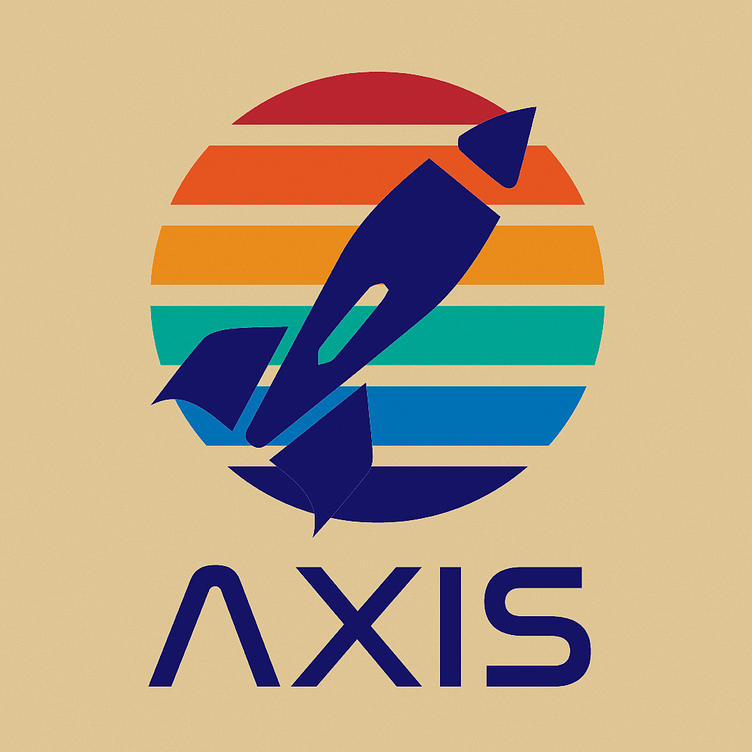
Logo Challenge day one
By combining the simple rocket shape, a muted warm background with slightly more vibrant colours, this logo has been created with a retro design in mind. These details paired alongside the same font that Nasa used, gives the logo a simplistic feel.
Here I have used Ai, linked it to my logo's colour scheme and combined it with other elements in order to produce a space exploration poster. The Venus typeface has been created from type outlines and expanded to create an outline.
More by Eleanor Millichip View profile
Like

