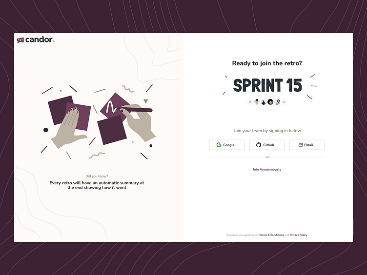
Candor Lobby Page
Have you ever designed a super basic page but you really put a lot of effort into being deliberate?
I recently designed a 'Lobby' page for Candor, this is a page where you end up when you are invited to a retro — it prompts you to sign in
I felt oddly proud of this page, even though it's not a very fancy or complicated design, mainly because it needed a lot of theatre;
Essentially, this is the page most users' see when they first interact with Candor:
✅ It needed to be functional and educational but also a little iconic.
✅ Since this link would be sent directly via email I needed to instill trust by showing signals like your team's avatars, sprint name and organisation name (in the email)
✅ The anonymous option needed to be visible but demoted
✅ Promoting features through 'did you know' style animation on the side
