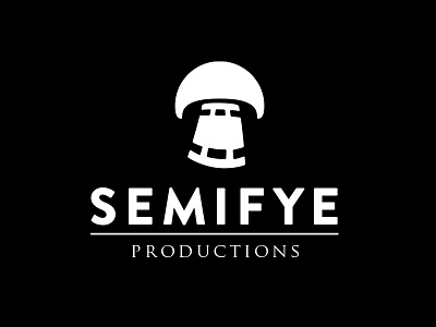
Semifye Logo Development
Development of the previous shot. I wanted to show the underbelly of the mushroom to add depth, and to also make it not look like a house (feedback I received from a fellow designer).
I have simplified the overall shape to the basic form, adding a curve to it to add some motion.
Would love to hear your thoughts on this, any comments will be appreciated!
More by Michael Tanner View profile
Like
