Portfolio web design
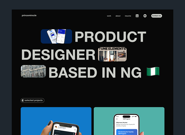
Hi there, I worked on some iterations for my portfolio website. My main goals were to curate a home for my projects and ensure my website reflected my personality as a designer. To achieve my objectives, I researched portfolios created by designers I admired, drawing inspiration from their approaches. I then delved into multiple visual design iterations, carefully selecting the one that resonated the most with my brand.
I came up with this for my home screen. I went with the idea for a bold typography as they spoke me personally. I decided to display some shots of my work from the jumpstart. Scroll below for a few more screens.
Projects section
For my projects section, I went with the idea of two sections with bold images displaying my work. Hence allowing the project images to shine through.
For the work section in essence, I went with the idea of displaying the work fully. My bold typography shines through adding a subtle softer color for better contrast among the main and supporting text.
View the work live here: https://princemirxcle.framer.website


