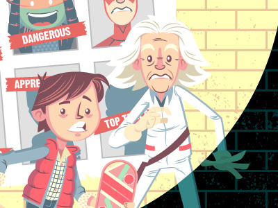
Back to the Future Past
Hey guys, I wondered if you could help me -- been staring at this for too long. I got a spotlight on Doc and Marty and because of the light colors on Doc and the light colors of the poster and wall, I feel there's not enough contrast. Let me know if that's the case.
Appreciate the help!
UPDATE: Made some great revisions. Thanks for all the advice!
More by Dennis Salvatier - tanoshiboy View profile
Like
