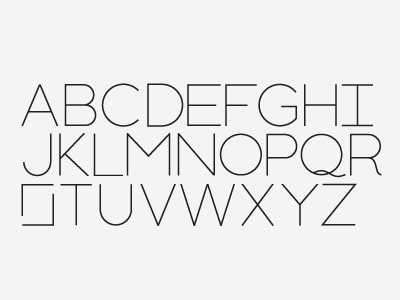
Font WIP
A work in progress. Ignore the letter S. I hate the letter S. I think we should have a vote to remove it from the alphabet. Nobody uses it anyway...
I'm trying to design a font (currently in Illustrator) which is really simple and made up of geometric shapes, but with some added character (see the Q and R) which I think will come out more in the lowercase when I get round to them. Feedback welcome, this is quite a quick thing.
More by Jonathan Ogden View profile
Like

