Team Codesign
With collaboration and co-working at the heart of everything they do, design agency Team Codesign strive to cultivate long-lasting relationships, noteworthy products and memorable experiences driven by an unwavering passion for their craft. To help achieve this goal, they needed a new identity that reflected all of this whilst bringing them up to date.
Whilst feeling relatively modern as a result of the lowercase letters and typeface selection (although that ’s’ makes me feel a little queasy), I felt Team Codesign’s previous logo was lacking a little meaning. Logos can be a little like tattoos. They don’t have to mean anything but it sure helps you connect to them if they do.
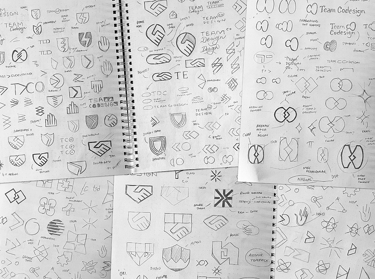
After interrogating the brief and market, I really wanted to flesh out the idea of collaboration and teamwork within a simple and refined mark. I liked the idea of two interlocking shapes forming a whole. I did a bunch of different versions of this but only had the eureka! moment for this one as it has a lot more meaning than just collaboration. I managed to work the idea of DNA along with an abstract C and D whilst still keeping it super duper simple. What a win!
I initially presented this sexy mark next to some bold and brave condensed all caps type. The team felt this was a little too off-the-wall and so we agreed upon a much more refined typeface in Forma DJR Display. However, it certainly wasn’t plain sailing as I HATED the g letterform. It was too formal and messed up the balance of the logotype so I completely redrew the bottom of it making it much more friendly and inviting - kinda smile-like don’t ya think?
Another subtle customisation I made was the ever so slightly rounded corners; again making the whole design much more approachable. Although, that now meant it felt distanced from the angular points in the logomark. A simple fix for this was to match the radius of the rounded corners of the type for the logomark and voila - a cohesive little family.
There’s a lot of waffle in colour theory saying things like red means love and danger, blue means trust and reliability, etc. This has to be total rubbish, how can red mean love and danger?! With that said however, orange is considered one of the more creative colours and it provided such a nice punch of energy against the charcoal and off white - it was the perfect match. To bolster the palette and provide more options, I included a deep turquoise which balanced the warm colours out nicely.
Here’s some lovely words from the founder and lead designer Abhishekkumar:
“When embarking on the journey of establishing a new brand identity, the path can often seem daunting and unclear. However, when we collaborated with Jack—a master brand designer—the experience turned into a celebration of creativity and precision. Against the backdrop of an era obsessed with AI and buzzwords, Jack's human-centric approach was a breath of fresh air. He immersed himself deeply in our concept, aligning with our vision almost telepathically.
From the moment Jack unveiled his initial designs, it was clear that he had not just listened, but truly heard us. His ability to distill our ideas into a robust and resonant visual identity was nothing short of remarkable. The outcome? A brand identity that resonated with every team member, exuding the kind of vibrancy that could only come from passionate craftsmanship.
As we build upon the strong foundation that Jack laid for us, I am compelled to share this experience. For anyone in pursuit of a brand designer who can translate your core values into a visual dialogue—Jack is your go-to wizard. Thanks to Jack, our brand is not merely recognized; it's felt. He reaffirms the belief that, even in a tech-dominated world, the nuanced artistry of human touch remains irreplaceable. If you're on the brink of a branding breakthrough or simply looking for inspiration, remember that the right partner can propel you from the ordinary to the extraordinary. Let Jack's dedication to our project be a testament to the incredible value a passionate and skilled designer can add to your brand's narrative.”
Ready to create or refresh your brand's identity?


