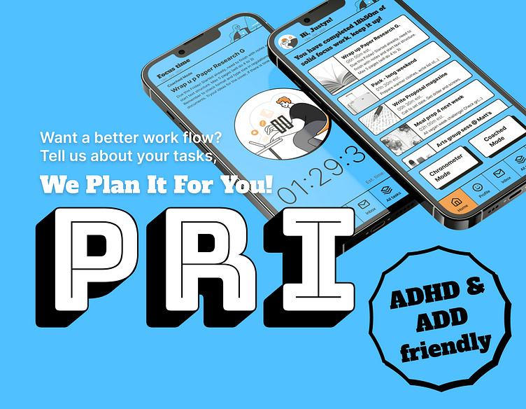
UX/UI Design: Case Study Productivity App
Project Type: Case Study App
Product: Inclusive Planning App, ADHD and ADD compatible
Role: Product and UX/UI Design, Branding (solo)
Case Study Scope: Designing an Inclusive Planning App, from the UX Research (learning mainly from secondary research, empathizing through user personas), to defining the Product, and finally to UI Design and Branding.
Goal Statement: This Inclusive Planning App will let users plan their work sessions in a way that is adjusted to their work mode preferences and focus abilities, which will affect anyone looking for an adaptable planning app by prioritizing tasks and setting a healthy action/break sequence, thus enhancing productivity and concentration. The effectiveness of this product would be measured by the recurring use of this app by a certain number of users, in a long span of time, which would prove it as actually beneficial and helpful to the end users.
Branding and Visual Identity: PRI came from word pooling around a set of concepts, from which the notion of prioritizing really emerges as what allows us to enter a consistent and nicely paced work session; in other words, to be able to focus on that one first task, to then follow through to the next ones. This directness influenced the choice of style of Neo Brutalism, that with straight forward shapes and colors doesn't invite ambiguity, and seems to proclaim focus and objectiveness.


