UI Fundamentals WIP
Hello!
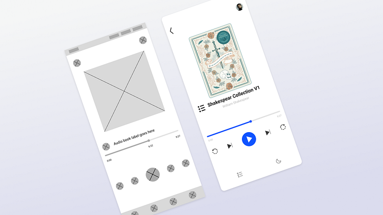
I am excited to share today's mini design work in progress (WIP) - UI Fundamentals for an Audiobook
Think of an audiobook UI as a canvas waiting for an artist's touch. At its core, this chapter dives into the essentials of visual design, akin to providing the building blocks needed to dress up a bare-bones interface.
Imagine these UI fundamentals as the threads, colors, and textures that transform a plain canvas into a captivating piece of art. I embarked on a journey that teaches me how to adorn these basic applications, breathing life and style into them.
Much like a skeleton provides structure to a body, these applications have the necessary structure, but they lack the visual appeal. Through this exploration, I've learned how to add the "clothing" – the design elements – that enhance their style and functionality.
Just as a skilled fashion designer knows how to accentuate the human form, understanding these visual design foundations empowered me to accentuate the functionality and usability of this application. Focusing on the 9 UI basics (Balance, Proximity, Alignment, Visual Hierarchy, Repetition, Contrast, Color, Negative space & Typography), it equipped me with the knowledge to imbue these skeletal interfaces with personality, flair, and a user-centric design that resonates with an audience.
I Hope you like it!
Let me know your thoughts in the comment section.
Don't forget to gently hit the like button and show some love
Thanks:)
