Terapify video conferencing
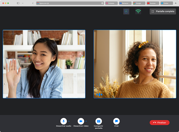
Terapify's video conferencing allows patients and psychologists to have therapy sessions without using another platform. In October 2020 we started working on the design with the development team.
Problem Statement
In October 2020 we launched the first video calls version for psychologists and patients. At this moment, the design was basic. The users could only join a therapy session and send messages. They couldn’t share screens, or control their microphone and camera. This caused users to not want to use it and prefer using another video calling platform like Zoom, Google meet, or WhatsApp.
After that, we received a lot of complaints about video calls.
First, we needed to know what browser and device psychologists used, because Terapify video conferencing works in the browser.
Research
In this research we focused on psychologists, since they are the face of Terapify in front of patients, and are the user who has presented the most complaints.
Online survey
We decided to use surveys because it was the data we needed were quantitative and the questions with choices.
We included the following questions: What browser do they use to give therapy
Which other platform/s do they, use? How often do they have problems using the Terapify platform?
What video call application do you use for therapy?
Why do you use another video call application?
Interviews
To identify the errors or problems that happen when giving therapy are.
Interviews were conducted with psychologists who frequently have problems in their sessions.
Opportunities
Evaluation of existing applications
The patterns used in the interface respond to the standard of the video call platforms.
For example, we find that in Zoom and Google the controls are kept at the bottom, and at the same time the first actions placed are microphone, camera, screen sharing and hang up.
The chat pattern using a sidebar allows the user to have the possibility to open and close the chat whenever they want.
The layouts were evaluated when more people join the video call.
Incorporation of help messages to inform the user about the status of their connection.
Incorporation of choosing which window to share.
Key features
• Secure meeting rooms
• Video call design patterns
• Screen sharing
• Internal chat
• Wi-Fi network alerts.
• Test their Wi-Fi network
• Select the camera and microphone to use in the session
• Allow the user to share their screen
• Layouts in couple sessions and individual sessions
• Mobile version
Desktop version
Mobile version
Conclusions:
In general, failures and complaints about audio and image are the most constant complaint from users, both psychologists, and patients.
The lack of use in the background from mobile devices, and not being able to share screens from these devices, is something that makes it difficult for them to take the sessions smoothly.
Not being able to take the session from any browser is also something that should be considered important, since users open the platform from the email on their cell phone, and it sends them to the native browser of the device.


