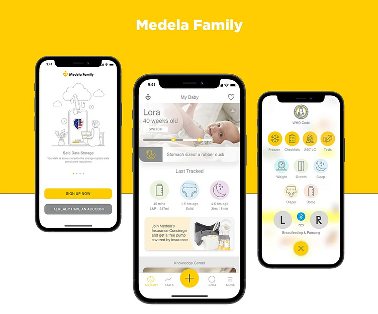
Medela Family App
Overview
Medela’s range of breast pumps covers all the potential needs of breastfeeding mums: from initiating breastfeeding for a prematurely born baby with the highest-standard, hospital-grade breast pump Symphony (available to rent), to expressing milk to cover the odd night out with the high-performance manual pump Harmony, to exclusive breast milk pumping with our top individual-use double side pump Freestyle.
Goals
To design a new Medela app featuring baby tracking functionality, Bluetooth connectivity to premium Medela breast pumps (to transfer pump tracking data) and design educational articles on breastfeeding, baby, pregnancy and promotion of Medela products with best-in-class user experience and premium feature set that enhances Medela’s products value.
Design Approach
My approach is to design an app to collect data from business team, feed pump features and constraints in order to recommend that users can easily customize. Using manual data to learn about habits of baby to provide feed, This received data helps to get maintain record from app we can then find out baby health keep watching and what produce they actually like the most during what time.
Wireframes
Wireframes are a skeleton view of the app or as I like to call it the bones this allows me to focus on key functions, elements, and actions before starting on visual design or putting on some skin. I opted for High-Fidelity wireframes this way I just have to splash on some color and place images and icons.
Final Designs
For this project I added the interaction screens, hover actions, screen overlays, and pressed buttons after the design was finalized to save time.
Conclusion
There is no space for distractions on limited timelines you have to stay focused on the project and organize yourself. I timed myself and set limits for how much time I would spend on a given task. I tried to keep it as simple as possible, starting from the sketches and the user journey then everything just fell into place.


