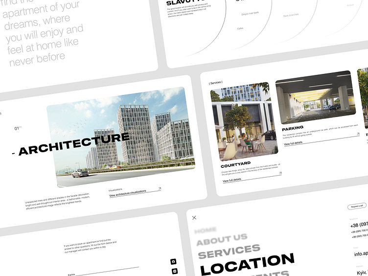
Website blocks for a residential complex
Hello, everyone! 🏀
A website for a residential complex should convey its style, comfort, and architecture, which is exactly what I expressed in my work in the form of lightness, lightness, and airiness of the site.
I used a blocky style with rounded corners to make the site easy for the user and nothing to cut the eye, white and light gray colors add style, and premium and convey the comfort offered by the residential complex.
Look at all these screens of the site, through them we managed to convey all the important and necessary information about this residential complex, to show its premium and advantages.
You can see the full case study on my Behance
Do you want to get the same cool solution for yourself?
Write to me in Dribbble or to one of the contacts below 👇
