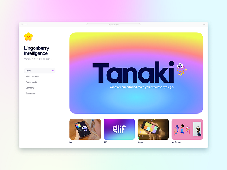
Lingonberry Intelligence redesign
I really enjoy the work that Lingonberry Intelligence has been doing. Their site caught my eye, especially in the unconventional yet contemporary sidebar approach in the original design by Pasquale D'Silva.
This is a redesign of their homepage layout to tighten up a few details and showcase their range of work more prominently. It's the first time I've used Japanese in a design.
More by Eli Schiff View profile
Like


