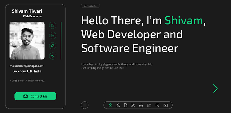
Web Developer Portfolio Design
A Sleek Web Dev Portfolio Design in Black & Green
Hey design fam, let's dive into a UI showcase that's as bold as it is balanced. Today, I'm presenting a web developer portfolio that ditches the fluff and focuses on a sleek, modern minimalism with a powerful twist. Buckle up, because this one's all about making a statement.
The Color Palette: A symphony of sophistication. Black forms the elegant backdrop, while pops of vibrant green guide the eye to key elements like headings and CTA buttons. White ensures text clarity and stands out beautifully against the dark canvas. Grey adds a touch of subtlety for subtext and secondary details. This mix is clean, impactful, and undeniably cool.
The Layout: Less is more. This portfolio embraces a clean, grid-based layout that prioritizes whitespace and hierarchy. Large, bold typography commands attention, while smartly placed animations add a touch of dynamism without sacrificing the minimal aesthetic. It's intuitive, scannable, and invites exploration.
The Details Matter: The subtle touches are what truly set this design apart. Custom-designed icons add a touch of personality, while micro-interactions on hover and scroll give users a sense of delightful discovery. It's all about creating an experience that's as visually compelling as it is technically smooth.
Who's This For? Web devs who want to command attention without resorting to noise. This design is for the modern developer who values clean lines, powerful visuals, and seamless functionality. It's a portfolio that reflects the technical prowess and design sensibility of its owner, all in one sleek package.
Ready to Level Up Your Portfolio Game? Take inspiration from this bold but balanced UI design. Remember, sometimes, less is truly more, and a strategic color palette can be your secret weapon. Show off your work with impact and elegance, and watch those projects get noticed!


