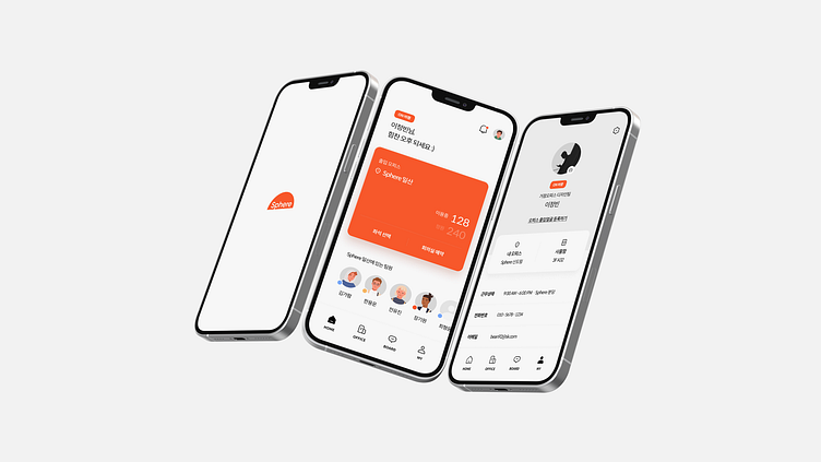
Sphere Workspace Platform App and Website design
Sphere Workspace Platform App and Website design
Mobile App Design
The Workspacec mobile app is designed with a clean and intuitive interface that prioritizes user experience. The app uses a minimalist color scheme that is easy on the eyes, ensuring that users can work for extended periods without experiencing fatigue. The iconography is simple and self-explanatory, allowing users to navigate the app easily. The typography is legible and attractive, enhancing readability. The layout is organized and logical, with frequently used features easily accessible.
Website Design
The Workspacec website mirrors the simplicity and functionality of the mobile app. It has a responsive design, ensuring a seamless experience across different devices and screen sizes. The navigation is straightforward, with a well-structured menu that makes it easy for users to find what they’re looking for. The color palette is consistent with the mobile app, maintaining brand identity and recognition. The content is well-organized and presented in a digestible format, enhancing user engagement.
UI Design
The UI design for both the mobile app and website is focused on usability and consistency. The design elements are consistent across the mobile app and website, providing a unified user experience. The interactive elements are designed to be predictable, making the app and website easy to use. The feedback mechanisms are clear, so users always understand what’s happening. The error handling is robust, with helpful error messages that guide users to resolve issues.
This design approach ensures that Workspacec is not just a tool, but a pleasant and efficient workspace that users enjoy interacting with. Please let me know if you need more specific details for your portfolio.


