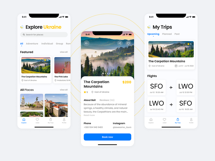
Explore Ukraine Travel Mobile App
👋🏻 Hello everyone!
I am excited to share my new case study - the Explore Ukraine Travel Mobile App.
The main purpose of this is to support tourism to Ukraine, to tell the world about the amazing places of Ukraine, and to book not only tours to locations but also to book transport and accommodation during the tour. In combination, this gives the user the feeling that their trip has been carefully taken care of.
They not only offered to buy a tour but also everything else necessary for a comfortable trip ✈️✨🇺🇦
Ukraine is too beautiful to hide from tourists. We have a lot to impress.
The style is determined by the colors of the flag of Ukraine, sans-serif font, and pastel colors that create a pleasant friendly impression.
Overview
Task:
Design an app that simplifies and personalizes Ukraine travel, promoting cultural immersion and stress-free experiences.
Goals:
Showcase Ukraine's hidden gems and cultural heritage to revitalize tourism.
Offer seamless booking for tours, transport, and accommodation in one place.
Curate unique, off-the-beaten-path tours that foster authentic experiences.
Key Features:
Personalized tour recommendations based on user interests and past experiences.
Integrated booking system for tours, transportation, and accommodation.
Offline accessibility for essential travel information.
Local guide connection for authentic experiences.
Interactive map and itinerary planner.
Community forum and chat for traveler interaction.
Multi-language support for a global audience.
Impact:
Empower travelers to explore Ukraine with confidence.
Revitalize Ukraine's tourism industry.
Foster authentic experiences and support local communities.
Showcase Ukraine's beauty and potential, leaving a lasting positive impact.
What I did as a solo Product Designer:
Conducted user research to understand target audiences (adventure seekers, solo travelers, families).
Defined user journeys for seamless navigation and efficient trip planning.
Designed an intuitive and engaging UI/UX with accessibility features.
Developed prototypes, conducted user testing, and iterated based on feedback.
Collaborated with cross-functional teams to integrate visuals, storytelling, and robust functionality.
Conclusion
Our app embarked on a journey to simplify and personalize exploration through user testing via Maze. Having organized wireframes and prototypes, we aimed to streamline the booking process and enhance user experience.
We assumed travelers value convenience and efficiency and sought to prove it through A/B testing.
The results were resounding: users achieved a 23% higher booking completion rate with the integrated system, exceeding our hypothesis by 3%.
This led to higher engagement, positive feedback, and ultimately, more fulfilled Ukrainian adventures.
Enter your text here..Images source: https://unsplash.com/
❤️ Press "L" if you love it and feel free to give me some feedback.
Let's connect: Facebook - LinkedIn
Have a great day!.


