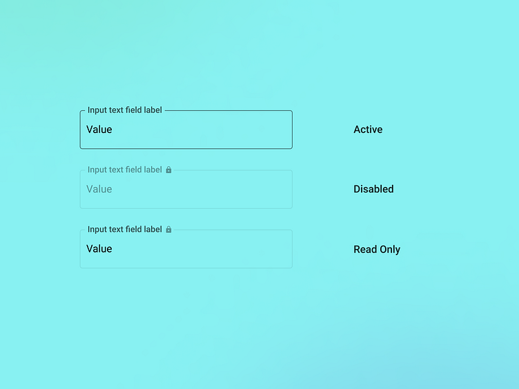
Disabled vs Read-only
Don't forget to include read-only states in your design system. Often designers will forget to include and distinguish between disabled and read-only states for form fields. It’s important to distinguish between the two because they have different meanings and use cases. For example, a disabled field might indicate that a user does not have permission to edit a field, while a read-only field might indicate that the field is pre-populated with data that cannot be changed.
The Web Content Accessibility Guidelines (WCAG) require that form controls be programmatically determinable and that their states can be programmatically set. Assistive technologies like screen readers should be able to identify the state of a form control and communicate it to the user. By using the disabled and read-only attributes correctly, designers can ensure that form controls are accessible to all users, including those with disabilities.
Above is a concept and an attempt to better distinguish form field states, particularly active, disabled, and read-only. Notice how both disabled and read-only feature a lock icon as part of the label (to convey uneditable). Also read-only features the same contrast for the input value and label as the active state, ensuring legibility.
What do you think of this idea?
...
Form controls here are based on Angular Material UI. Lock icons are conceptual and colors are custom themed.
