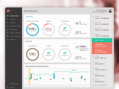
Parasut Dashboard
Paraşüt's dashboard is the first snapshot of the business a user sees – color coded indicating in- and outflow of invoices and expenses; a timeline indicating this month's cash flow, and a to-do list on the right.
Does this interface provide the right visual overview? What could we improve here? Comments are welcome! You can have a further look at the (Turkişh) app at www.parasut.com
More by Paraşüt View profile
Like

