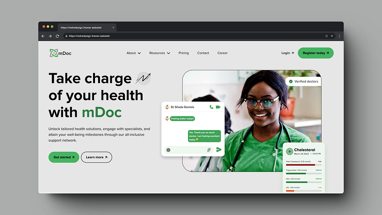
mDoc (Landing Page Redesign)
A Holistic Approach to Design, Content, and User-Centered Improvements ✨
I improved the landing page using design principles like spacing, visual hierarchy, typography, and color. With tools like Figma and Photoshop, I transformed its aesthetics. In addition to the visual updates, I refined the content, blending my copywriting and UX writing skills. The result is informative, user-friendly content, enhancing visitor comprehension and engagement. This holistic approach significantly elevates the landing page's user experience and visual appeal.
The images below are snapshots of the landing page as of the time of the redesign.
To flex my muscles, I developed the landing page on Framer—responsive on all devices. Check it out here.
I have created a comprehensive presentation of my redesign process, which you can view here.
Want to talk about a project? Feel free to contact me at kayodesasona100@gmail.com. Looking forward to connecting with you!

