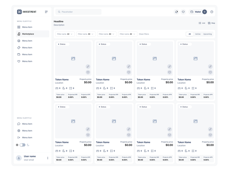
Wireframing | Property page
Hi Guys! ✌️
The primary focus of my design solution was to create a convenient and user-friendly experience, particularly for novice investors in Crypto real estate. I recognized that simplifying the complexities of blockchain and cryptocurrency transactions was paramount. I restructured the platform's navigation, simplifying it to ensure users could easily find what they needed. I adopted a minimalist design approach, reducing clutter and emphasizing key information. This allowed users, especially those new to crypto, to focus on the essentials without distractions.
🚀 Dive into my latest UX research project on the Blockchain Real Estate Marketplace. Witness how blockchain technology is revolutionizing the real estate industry. Want to see more? 🌐 Head over to my Behance profile for an in-depth look at the project, where innovation meets design! 🏘️💡
👉 Explore the Project on Behance - https://www.behance.net/gallery/188093765/Blockchain-Real-Estate-Marketplace-UX-research
If you're eager to keep up with my most recent design endeavors and seek inspiration from my unique creative methods, make sure to follow me. With regular updates and insights into my design process, you'll gain valuable insights into the world of UX design and stay at the forefront of industry trends.
Hope you like it and feel free to leave comments and feedback.
Don't forget to press "L" if you enjoy watching this ❤️.
Thanks for checking it out! If you have comments, let me know!
Say hello at 📧
ux.sergushkin@gmail.com
Visit my Website 🌎
dmitrysergushkin.com
For more inspiration, visit my profiles ✨
