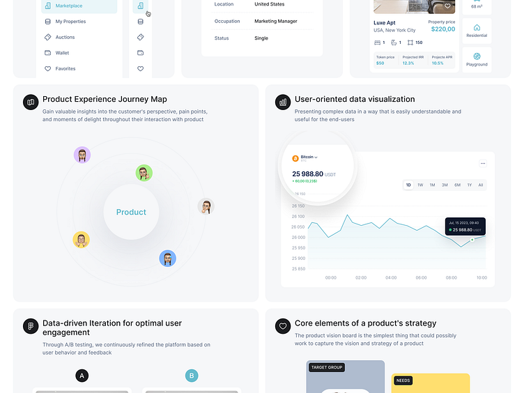
Bento grid features presented
Hi Guys! ✌️
By employing a grid-based layout, bento design patterns divide a website's content into distinct sections or compartments. Each compartment serves as a dedicated space to showcase a specific feature, allowing users to navigate and digest information easily. This intuitive and visually pleasing approach ensures that your website's visitors can quickly grasp the unique selling points of your product or service.
Dive into my latest UX research project on the Blockchain Real Estate Marketplace. Witness how blockchain technology is revolutionizing the real estate industry.
👉 Explore the Project on Behance - https://www.behance.net/gallery/188093765/Blockchain-Real-Estate-Marketplace-UX-research
If you're eager to keep up with my most recent design endeavors and seek inspiration from my unique creative methods, make sure to follow me. With regular updates and insights into my design process, you'll gain valuable insights into the world of UX design and stay at the forefront of industry trends.
Hope you like it and feel free to leave comments and feedback.
Don't forget to press "L" if you enjoy watching this ❤️.
Thanks for checking it out! If you have comments, let me know!
Say hello at 📧
ux.sergushkin@gmail.com
Visit my Website 🌎
dmitrysergushkin.com
For more inspiration, visit my profiles ✨
