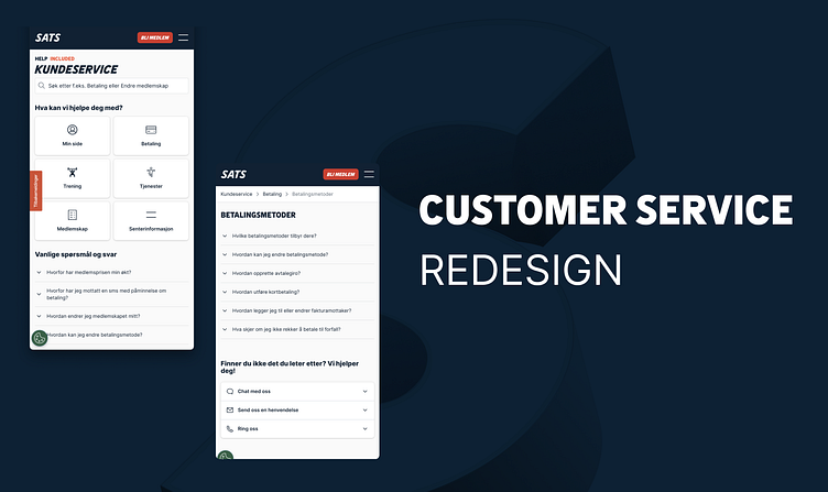
Redesign of customer service pages
In cooperation with customer service we looked at the information architecture of the SATS help pages. Important insight in this project was:
What do we get questions about?
What do we get a lot if requests about, that members could actually solve them selves digitally through My page.
Banner blindness
In the previous design we had search an links to important pages on the top of the page, to help members find their answer quicker. But we experienced that not all members saw them, just continued browsing down the page.
In Hotjar we also saw on the heat map that visitors tried to click on the headings “Membership”, “Payment” ++ which was not links.
Reduce clicks - Get help quicker
We wanted to reduce clicks to find a solution to their issue quicker, and also make it easier for members to get in contact with us, when they had to.
Previously all questions had their own page, even if they were only a sentence long. This resulted in a lot of clicks if you didn’t find the correct questions immediately.
In the redesign we decided to display the questions and answers in an accordion, this made it easy to navigate between the questions and answers in the same category.
Get help where you are
As a part of this work, we also created what we called an FAQ block. The concept was to provide help to the member in the context where the questions would come up.
Instead of making the member go and find the questions and answers under the customer center pages, we added the relevant questions and answers to self service pages and landing pages.
SEO
Another important aspect of this project was to design for good SEO. We could see that a lot of visitors to our help pages came directly from Google. To get good SEO we did the following:
Made category pages for the main categories
Used clear and short titles and good descriptions for each category and sub category.
Used same words and phrases that our members use.
Our main goal was to help our members, not getting more visitors to our web site. The content was structured as:
This made it possible for google to present it in a FAQ in the search results.
Content design
As a part of the redesign the people responsible for the content also started cleaning up the information, restructure the articles, rename categories etc.


