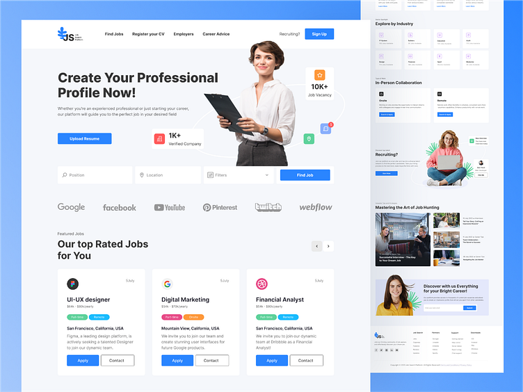
Job Search Platform Concept
Hi, Creatives 👋
In this shot, I'm showcasing a job search platform. I've utilized various UX/UI design principles and methods. I've employed color contrast to draw attention to key elements like filters, job categories, and CTAs. The primary information is presented clearly and simply, aiding in a quick understanding of the platform's functionality. I've maintained a clear sequence of element placement and their functions. Each screen displays the full range of information that the user needs.
Finally, a personally designed logo 🔵 strengthens the platform's identity and creates a sense of professionalism. I hope this shot will make an impact on those seeking jobs and help them find what they're looking for.
I would be delighted to read your feedback and receive your comments.
Press L if you like it ❤️
Thank you.
I am open to your suggestions 🤠 please send your request to my email at kateryna.burych@gmail.com, or contact me via Linkedin
