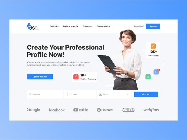
Job Search Platform Concept
Hi, Creatives 👋
The interface I created for the Job Search Platform focuses on maximizing user convenience. On the first screen, you'll find a menu that easily navigates through the main sections. The title and subtitle convey the platform's purpose. Graphical elements and photos help users better understand the search process🔁♾️✴️
Special attention is given to the "Find Job" CTA button to prompt active engagement. There are fields for entering positions, locations, and filters to ensure search accuracy.
Finally, a personally designed logo 🔵 strengthens the platform's identity and creates a sense of professionalism. I hope this shot will make an impact on those seeking jobs and help them find what they're looking for.
I would be delighted to read your feedback and receive your comments.
Press L if you like it ❤️
Thank you.
I am open to your suggestions 🤠 please send your request to my email at kateryna.burych@gmail.com, or contact me via Linkedin
