bareMinerals Complexion Rescue ReDesign
Package Design Concept
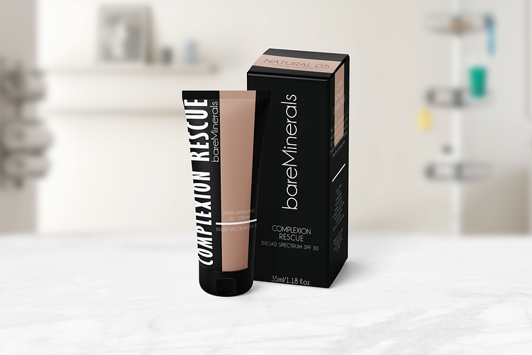
Bare Minerals, a renowned name in natural beauty, has historically favored simplistic and enclosed packaging designs. In my redesign of their Hero Sku, Complexion Rescue, I aimed to enhance user experience and convenience.
This involved adding a transparent window for consumers to monitor product levels, employing bold side labeling for easy identification, and incorporating a flat cap for practicality during storage and travel.
I also ensured consistency by mirroring the bottle's vertical text on the box and provided a color swatch on the box's top for effortless shopping.
Moreover, I included the UPC at the bottom of the box to streamline inventory management for retailers.
More by Cyndi Castor View profile
Like
